Userbot: Ovy for Sales
From Enterprise software to SaaS
Userbot decided to evolve its enterprise chatbot technology into a product that could reach a wider audience without the need for technical setup or enterprise onboarding. The goal was to create a standalone, self-service solution that smaller sales teams could activate and use immediately.

Overview
Ovy for Sales is the result of this transformation. It streamlines the sales workflow by identifying website visitors, starting personalized conversations, qualifying leads, and automatically booking meetings. Everything is designed to be quick to set up and easy to use, even for non-technical teams.
Challenge
The main challenge was transforming a Sales-assisted enterprise platform into a fully self-service SaaS product.
The key focus was designing a new onboarding flow that guided users step by step, communicated value immediately, and reduced technical friction to maximize adoption and activation.


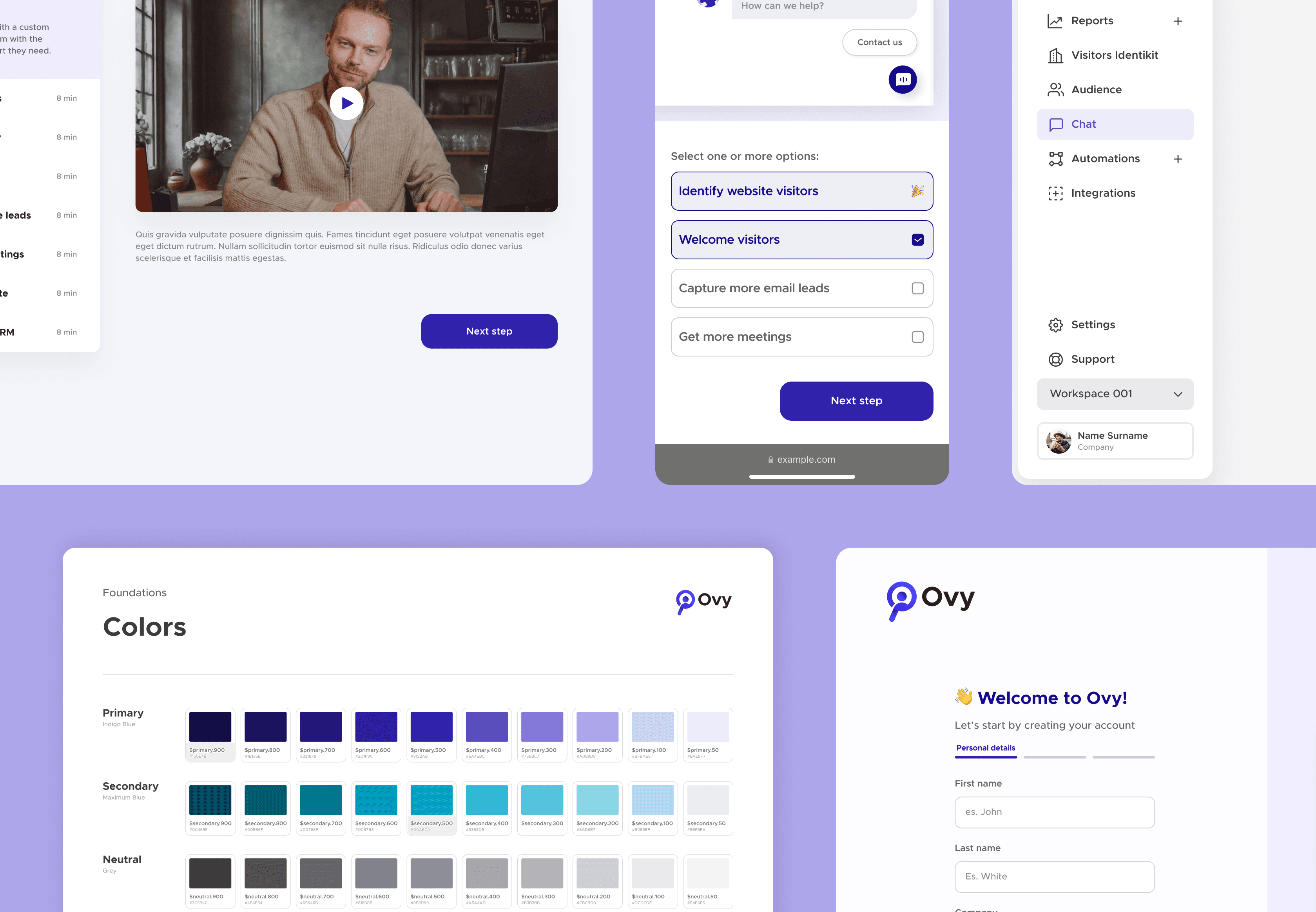
To support the new self-service model, I designed a homepage with step-by-step tutorials.
These tutorials guide users through their first login, helping them set up the chatbot, understand key features, and start generating value immediately.

New Design System
To ensure consistency, scalability, and a cohesive user experience, I developed a design system for Ovy for Sales.
It standardizes components, colors, typography, and interactions across the platform, making the interface more intuitive and predictable. The system also allows faster iterations for new features, supports the onboarding flow, and ensures that all users experience a polished and professional interface from their first login.


Following are some examples of structuring design system items organized with Figma's multiple components and shown in tables to map all sizes, states, and extra configurations.

Redesign sidebar
As part of improving usability, I redesigned the sidebar to make navigation more intuitive and efficient.
The new layout organizes features logically, highlights key actions for sales teams, and integrates seamlessly with the onboarding flow.
This redesign reduces cognitive load, helps users find what they need quickly, and supports a smoother experience from first login to daily use.

